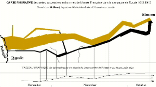
 e Nightingale's series of graphics depicting the effect of improved hygiene on reducing deaths among the British troops in the Crimean War, graphical displays of data have been used to describe
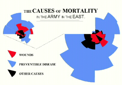 the effects of various factors on the health of a variety of populations. Today the Harvard-MIT Division of Health Sciences and Technology have brought the graphical display of disease-related data to the 21st Century with their health maps that can be found here. They provide a graphical display of various public health issues throughout the world. Mousing over your area of interest will provide you with a brief explanation of the health concern and one click provides you with greater detail.
 How cool is that! I admit, I love Statistics, and I am a big fan of public health ... so I may find this tool a little more exciting than most. But, if you are doing research on any public health in any place in the world or if you are planning to travel anywhere, you might find this tool helpful.
By the way, if you are interested in learning more about
Florence Nightingale's use of graphical displays of data,
check out this site.

Thank you for indulging my inner nerd!

1 comment:
...and you teach math? This is very interesting. I am sure Jim has a few great primary douments on this as well. But, when you think about it, history and stats go hand an hand.
Do you teach a lesson on this?
Post a Comment